Have you ever sat in a client meeting, only to realize your SEO reports didn’t quite tell the full story? Or worse, you presented data that left your clients confused rather than convinced. That lightbulb moment—where I understood that my reporting was missing the mark—changed everything for me. I knew I needed a smarter way to visualize KPIs and demonstrate real value in my SEO campaigns.
Why Top SEO Reporting & KPI Visualization Matter More Than Ever in 2025
In today’s hyper-competitive digital landscape, agencies face the challenge of turning complex data into actionable insights. With the rapid evolution of search engine algorithms and the rise of local SEO, traditional reporting methods simply aren’t enough anymore. Clients demand clear, visual, and impactful reports that show tangible results and justify their investment.
Research shows that visual data representation can improve comprehension by up to 400%. That’s a staggering number—highlighting why KPI visualization strategies are critical for success. As I delved into the latest tools and techniques, I realized that mastering these strategies could be the game-changer for my agency’s growth and client retention.
But here’s the real kicker: many agencies still rely on outdated reporting dashboards that are hard to interpret and even harder to act upon. Early on, I made the mistake of focusing solely on raw data exports, ignoring how the data was presented. That led to missed opportunities and frustrated clients. I learned the hard way that effective KPI visualization isn’t just about data; it’s about storytelling.
If you’re tired of reports that fall flat or struggle to showcase your SEO wins convincingly, you’re not alone. The good news? There are proven strategies and tools designed specifically for agencies in 2025. From map-based rank tracking to advanced KPI dashboards, these innovations can help you communicate results more effectively and differentiate your services in a crowded market.
In the sections ahead, I’ll guide you through the most effective SEO reporting and KPI visualization strategies that I’ve personally tested and refined. Whether you’re looking to improve local SEO insights or streamline your reporting process, these tips will set you on the path to crafting compelling, data-driven stories that clients love.
Are you facing this exact problem? If so, let’s dive into how you can turn your SEO data into powerful visual stories that drive results.
Set Up Your Data Collection Framework
Before diving into visualization, ensure your data collection is accurate and comprehensive. Use advanced tools like map-based rank tracking and SEO reporting software that integrate with your clients’ local listings and Google Business Profiles. This setup guarantees real-time, precise data, reducing discrepancies and making your reports trustworthy.
Transform Raw Data into Visual Stories
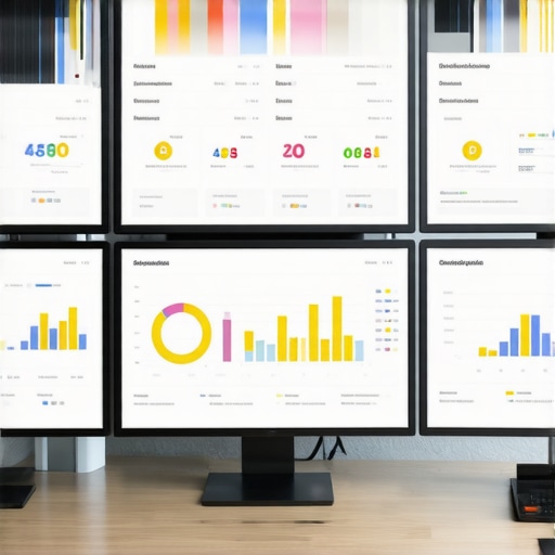
Think of raw SEO data as a jumble of puzzle pieces. Your goal is to assemble these pieces into a compelling story. Use KPI visualization strategies like dashboards, heat maps, and trend lines to make this happen. For example, I once used a heat map to show local keyword rankings over time, which instantly highlighted areas needing focus, impressing my client with clear, actionable insights.
Create Dynamic Dashboards
Leverage tools like Google Data Studio or Tableau to build dashboards that update automatically. Structure your dashboards around key KPIs such as local rankings, organic traffic, and conversions. Use color-coding to emphasize changes—green for growth, red for decline. I once created a dashboard that automatically refreshed weekly, allowing me to spot ranking drops immediately and address issues before they became crises.
Implement Map-Based Visualizations
Map visuals are gold for local SEO. They show rankings geographically, helping clients understand regional strengths and weaknesses. Use map-based rank tracking tools integrated with Google My Business insights. I applied this for a local restaurant chain, and the visual maps revealed underperforming locations—prompting targeted local campaigns that boosted visibility significantly.
Automate Regular Reporting
Automation saves time and ensures consistency. Set up scheduled reports that pull updated data and generate visual reports automatically. Use platforms that support scheduled emailing, so clients receive timely updates without manual effort. I used this approach for monthly reports, which freed up hours and kept clients engaged and informed.
Storytelling with Data
Remember, visualization is about storytelling. Use annotations and narrative overlays within your dashboards to explain why trends happen. For example, I added notes about Google algorithm updates coinciding with ranking drops. This contextual layer made my reports more insightful and helped clients grasp complex SEO dynamics effortlessly.
By systematically implementing these steps, you’ll turn raw SEO data into engaging visual stories that demonstrate real value, helping your agency stand out in 2025’s competitive landscape. Dive deeper into each technique and explore tools like mastering SEO insights for even more advanced strategies.
While many SEO professionals and agencies focus heavily on data collection and basic visualization techniques, they often overlook the subtle yet critical nuances that can make or break the effectiveness of their reporting. This oversight stems from a common misconception: that more data and prettier dashboards automatically lead to better client understanding and decision-making. Let’s dig deeper into what most people get wrong about advanced SEO KPI visualization—and how to avoid these pitfalls.
Contrary to Popular Belief: Visuals Alone Don’t Guarantee Clarity
One of the biggest myths is that complex data automatically becomes clear when visualized properly. However, in my experience, this isn’t true. Overloading dashboards with multiple charts, metrics, and maps can actually muddy the waters, confusing clients rather than enlightening them. A truly effective KPI visualization strategy involves not just displaying data but curating it—highlighting what matters most and ensuring the story is easy to follow. For instance, simply adding more heatmaps or trend lines without context can overwhelm clients who need actionable insights, not just raw visuals. To master this nuance, you should focus on storytelling—using annotations and narrative overlays to guide viewers through the data narrative.
The Oops Factor: Beware of Misleading Map Visualizations
Map-based visualizations are powerful for local SEO, but they come with their own risks. A common mistake is presenting geographic data without considering underlying factors like search volume, competition, or seasonal trends. For example, a heat map showing rankings in different regions might suggest underperformance in certain areas, but if that region has low search demand, the visualization can mislead clients into investing unnecessarily in local campaigns. To avoid this trap, integrate multiple data sources—like Google Business Insights—and provide contextual commentary. Advanced marketers also leverage tools that combine map visualizations with KPI overlays for a more accurate picture of regional performance.
Advanced Question: How Can I Ensure My KPI Visualizations Are Truly Actionable for Clients?
Great question. The key lies in aligning KPIs with strategic objectives and presenting them in a way that prompts decision-making. Instead of just showing rankings or traffic numbers, tie KPIs to specific client goals—such as increasing local conversions or expanding into new markets. Use color-coding, trend analysis, and scenario modeling to illustrate potential outcomes. Studies from industry experts emphasize that KPIs should be contextualized within client priorities to drive meaningful actions. Remember, data visualization isn’t just about pretty pictures; it’s about guiding strategic decisions.
Have you ever fallen into this trap? Let me know in the comments. Improving your understanding of these nuances can significantly elevate your SEO reporting game and client satisfaction.
Once you’ve set up your advanced SEO tools and visualization strategies, the next crucial step is ensuring they keep working effectively over time. SEO is not a set-and-forget process; it requires regular maintenance, updates, and strategic adjustments to stay ahead in the ever-evolving search landscape.
How do I maintain my SEO tools and strategies over time?
First, choose reliable, scalable tools that can grow with your agency’s needs. For instance, I personally rely on SEO reporting software that offers automation, customization, and integration capabilities. This ensures your reports stay current and relevant without manual intervention. Regularly update your tracking parameters, keyword sets, and data sources to reflect seasonal trends and new market opportunities.
Next, implement a routine audit schedule. I recommend monthly reviews of your dashboards and KPIs. During these audits, verify data accuracy, check for broken integrations, and assess whether your visualizations still align with your clients’ goals. This proactive approach prevents minor issues from snowballing into major reporting failures.
Utilize automation wisely. Tools like Google Data Studio or Tableau can be scheduled to refresh data and generate reports automatically. This not only saves time but also ensures your reports are always up-to-date, providing clients with timely insights. Remember, consistency builds trust, so your automated reports should mirror your strategic objectives.
Stay informed about industry changes. Search engines are constantly updating their algorithms, and local SEO dynamics shift regularly. Follow authoritative sources such as Google Business Analytics updates and industry blogs to adapt your strategies accordingly. Incorporate new features and data points into your tools as they become available to maintain a competitive edge.
Invest in ongoing training for your team. Mastering new visualization techniques or analytics platforms can dramatically improve your long-term results. For example, I regularly attend webinars and workshops focused on advanced KPI visualization. This continuous learning ensures your strategies remain innovative and effective.
Future Trends in SEO Maintenance
Looking forward, automation and AI-driven analytics will play a bigger role in maintaining and scaling SEO efforts. Expect tools to become more intuitive, offering predictive insights and real-time alerts. Preparing now by integrating AI capabilities into your existing tools will position your agency for scalable success.
Take the time today to review your current setup. Try implementing scheduled data audits combined with automated report generation. These small but impactful steps will ensure your SEO tools and strategies remain effective, reliable, and ready to adapt to future challenges.
The Hardest Lesson I Learned About SEO KPI Visualization
Early in my journey, I believed that more complex visuals meant better understanding. It took a few failed client presentations and some awkward moments before I realized that simplicity paired with storytelling is the true power of effective KPI visualization. Sometimes, less truly is more, especially when guiding clients through intricate data stories.
3 Myths About SEO Reporting That Held Me Back
Myth 1: All data visualizations are created equal. The truth is, tailored visuals that highlight specific KPIs aligned with strategic goals make a world of difference. Myth 2: Automation replaces the need for human insight. In reality, adding narrative context and annotations transforms raw data into actionable intelligence. Myth 3: More data means better insights. Focused, relevant data is what drives smarter decisions, not endless numbers.
What Industry Experts Won’t Tell You About Local SEO KPIs
Many professionals overlook the importance of geographic context in map-based visualizations. Integrating local insights such as search volume and competition levels with ranking maps creates a nuanced story that clients can truly leverage for growth. Also, experts emphasize continuous iteration—your KPI dashboards should evolve alongside your clients’ changing goals and market conditions.
My Essential Toolkit for SEO KPI Visualization
My go-to tools include Google Data Studio for dynamic dashboards, which I trust for its flexibility and ease of sharing. I also rely on advanced KPI visualization strategies to craft compelling, story-driven reports. For local SEO insights, map-based rank tracking tools have been game-changers in demonstrating regional strengths and weaknesses. These tools empower me to deliver measurable results that resonate with clients and drive strategic actions.
Your Turn to Try
As you implement these insights, remember that the true power of SEO KPI visualization lies in your ability to tell a story—one that aligns with your client’s goals and illuminates the path forward. Keep experimenting, refining, and listening to your clients’ feedback. The future of SEO reporting is about clarity, impact, and meaningful engagement with data. Dive into these strategies today and watch your results—and client trust—grow exponentially. Are you ready to transform your SEO reports into compelling stories that truly drive results?