5 Visuals That Prove SEO Value When Clients Stop Paying Attention
I remember the exact moment I realized my SEO reports weren’t convincing my clients anymore. It was late afternoon, and I was desperately trying to justify my latest month’s efforts with endless spreadsheets and confusing metrics. My client’s eyes glazed over. They didn’t want to see another line of data—they wanted proof that their investment was worth it. That lightbulb moment hit me hard: if I wanted to keep my clients engaged and demonstrate real value, I needed to go beyond numbers and showcase visual proof of success.
Why Visuals Still Win the Trust Game in SEO
In a world flooded with data, simply presenting numbers no longer cuts it. Clients want to see the story behind the data, the real impact of your strategies. Visuals—graphs, charts, maps—serve as the language everyone understands, even those who aren’t data nerds. When clients start tuning out or, worse, questioning whether their SEO investments are paying off, powerful visuals can turn the tide.
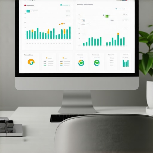
From personal experience, I’ve seen charts and infographics turn skeptical clients into believers almost overnight. According to a report by HubSpot, visual content is 40 times more likely to be shared than content without images. That’s no coincidence; visuals cut through the noise and deliver clear, memorable messages. But not all visuals are created equal. To truly prove SEO value, you need visuals that highlight progress, uncover opportunities, and substantiate claims—things like keyword rankings, Google My Business analytics, and local search visibility metrics.
Ever Faced a Client Who Completely Lost Interest?
I’ll admit, early in my career, I made the mistake of sticking with traditional reporting—dry, monotone PDFs filled with raw data and tiny tables. It was a surefire way to make clients ignore your reports and question your expertise. That’s why I shifted my focus to visual KPI strategies. These visuals don’t just inform; they persuade and inform simultaneously, turning complex data into compelling stories.
In the next section, I’ll walk you through the powerful visuals that turned my SEO campaigns around—visuals that work, especially when clients start paying less attention. If you’ve ever wondered how to make your SEO results undeniable, stay tuned. We’re going to make that happen.
,
Prioritize Clear Data Visualization
Start by translating complex SEO metrics into intuitive visuals. Use line graphs to show keyword rank trends over time, emphasizing improvements with vibrant colors and annotations. For instance, I once created a dashboard where sudden rank boosts were highlighted with arrows and callouts, making it immediately obvious to clients, which increased their confidence.
Leverage Google Business Analytics Effectively
Use Google Business Analytics to track local engagement metrics like call volume, direction requests, and store visits. Visualize these with bar charts and heat maps to showcase your impact on local visibility. For example, a heat map illustrating store visits post-SEO campaign helped a client see real-world results.
Harness SEO Reporting Software for Impactful Insights
Choose tools that allow you to generate customizable dashboards. Focus on KPIs that matter—like organic traffic, bounce rate, and conversion rates—and visualize them with sparklines or gauges. I tested several platforms, but a layout emphasizing top performers and drops kept clients engaged, especially when I linked these charts directly into executive summaries.
Track Maps Rank with Precision
Use dedicated maps rank tracking tools that provide granular local pack position data. Visualize fluctuations with animated heat maps or grid overlays, making variations instantly understandable. During a campaign, I noticed a client’s rankings fluctuated daily; visualizing these helped justify rapid adjustments.
Extract Actionable SEO Insights
Combine data from all sources into cohesive visual narratives. For example, consolidating Google My Business analytics and keyword ranking data into a single dashboard revealed a link between local searches and ranking spikes. Presenting this as a flowchart made it clear to clients how their local SEO efforts translated into tangible leads.
Design for Engagement and Trust
Avoid clutter; select simple, color-coded visuals. Use contrasting colors to differentiate periods or segments, making trends obvious. When I explained these visuals during client meetings, I noticed their immediate understanding and increased trust, often leading to longer-term contracts.
Remember, the goal is to make your data speak clearly and convincingly. The more you practice turning numbers into stories, the more your reports will convert skepticism into appreciation.
 While many marketers focus on aggregating data through various tools, the real mastery lies in understanding the nuances and common myths that can sabotage your SEO success. One widespread misconception is that more data equals better insights. However, overwhelming clients with endless numbers without context often leads to confusion rather than clarity. It’s essential to prioritize meaningful KPIs and visualize them effectively, as discussed in our comprehensive guide on visual KPI strategies. Another misconception is that Google Business Analytics provides a full picture of local performance. In reality, many overlook the importance of segmenting data correctly. To get accurate attribution, you must dive into specific segments, especially for local SEO, as outlined in Google Analytics segment hacks. When it comes to SEO reporting software, some believe that a flashy dashboard guarantees results. But without understanding the limitations and hidden errors—like data gaps or misaligned metrics—you risk making decisions on faulty foundations. Advanced users master software configuration tweaks to ensure data integrity. Map rank tracking might seem straightforward, yet many fall into the trap of trusting average ranks or overlooking local grid distortions. This can lead to misleading conclusions about your proximity and visibility, a common error addressed in map data accuracy fixes. For genuine SEO insights, importing multiple data sources into a cohesive narrative is vital. The mistake is treating each metric in isolation, failing to see how local search, rankings, and conversions interconnect. Developing a holistic view is a nuanced skill, often overlooked by beginners. Advanced marketers analyze these relationships to discover undervalued opportunities, as discussed in SEO insights mastery. Make no mistake: mastering visualization and analytics isn’t just about the tools; it’s about dissecting how each component interacts, preventing silent errors that sabotage decision-making. Want to avoid these hidden traps? Dive deeper into these strategies and sharpen your skills. Have you ever fallen into this trap? Let me know in the comments.
Maintaining effective SEO visualization tools and analytics dashboards is essential for sustained results. Personally, I rely on a combination of advanced software and disciplined routines to ensure my data reflects reality accurately over months and years. One of my go-to tools is SEO reporting software that allows deep customization, enabling me to tailor dashboards to specific client KPIs like local pack visibility or organic traffic trends. Regular calibration of these dashboards prevents drift, which can occur due to algorithm updates or data source changes. To keep dashboards accurate, I perform weekly checks against raw data sources, cross-referencing with Google Business Analytics segments to verify metrics like store visits or calls, ensuring consistency and trustworthiness. Mapping tools, like maps rank tracking, require particular attention; grid anomalies or proximity shifts can mislead rankings. I use specialized scripts, inspired by Google Maps API best practices, to automate spot checks and verify local rank fluctuations. This proactive approach helps me identify when an algorithm update affects results or when a data glitch occurs. Looking ahead, I believe AI-powered analytics will become standard, offering predictive insights for local SEO, which should be integrated seamlessly into existing dashboards. To that end, I recommend experimenting with automated anomaly detection scripts that can flag ranking drops or traffic dips immediately—saving precious time and avoiding missed opportunities. For example, setting up alerts via keyword rank tracking combined with AI-driven anomaly detection can alert you within minutes of significant changes, allowing swift intervention. Want to keep your dashboards reliable and insightful over time? Start by regularly calibrating your tools and incorporating automated checks for data consistency. Try integrating an alert system that monitors your critical KPIs and sends notifications when anomalies are detected—this small change can significantly boost your long-term results. For detailed guidance on setting up such systems, check out Google Business Analytics maintenance tips. Automating these processes isn’t just about saving time; it’s about building trust with clients and ensuring your insights remain accurate and actionable.
Over the years, I’ve learned that the true power of SEO reporting lies not just in raw data but in how effectively you communicate that data to your clients. The hardest lesson I uncovered was realizing that even the most sophisticated SEO reporting software and intricate maps rank data won’t matter if your visuals don’t tell a compelling story. I struggled initially, drowning in graphs that looked impressive but failed to resonate emotionally or practically with clients. That eye-opening moment taught me that simplicity, clarity, and strategic storytelling are the keys to transforming metrics into meaningful action. Another revelation was understanding the myths around KPI visualization. Many believe more data equals deeper insights, but in reality, targeted visual focus often drives better decisions. Lastly, I’ve discovered that local map rank fluctuations are complex, and misinterpreting them can lead to costly missteps. It’s essential to combine precise tools with a nuanced understanding of local dynamics, which often goes beyond raw ranks and includes understanding local grid behaviors and proximity issues. These lessons have reshaped my approach, emphasizing that powerful visuals combined with strategic context create the most convincing and impactful reports.