I recall a moment early in my agency journey when I sat staring at a jumble of numbers on my screen, feeling overwhelmed and frustrated. My KPIs seemed like a foreign language—meaningless, confusing, and ultimately unhelpful in driving real growth. It was a lightbulb moment when I realized: I wasn’t just missing the right data; I was presenting it ineffectively. That revelation led me down a path of experimenting with data visualization tweaks that completely changed my approach—and my results.
If you’ve ever wrestled with cluttered dashboards, uncertain which metrics truly impact your growth, or wondered why your reports don’t inspire action, you’re not alone. The truth is, many agencies struggle with making data insights compelling and clear. But here’s the good news: with a few strategic tweaks to how you visualize your KPIs—especially in the realms of SEO, maps rank tracking, and Google Business Analytics—you can unlock new levels of clarity and client trust.
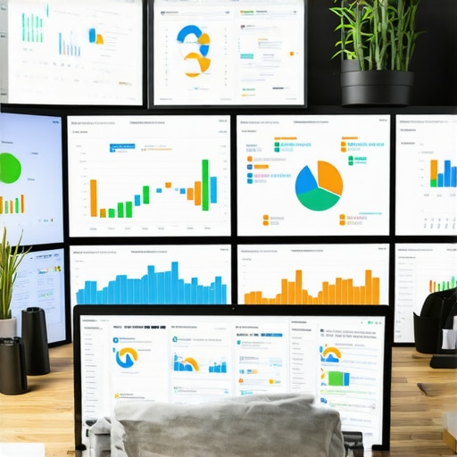
Today, we’re going to dive deep into three proven data-driven visualization tweaks that are set to revolutionize your agency’s KPI reporting for 2026. These tweaks are not about adding complexity but simplifying insights and making them stick. After all, according to research, visual data can be processed 60,000 times faster than text—so leveraging that power effectively matters more than ever.Before we get into the nitty-gritty, let me ask: have you ever sent a report that left your client more confused than enlightened? If so, you’re in the right place. We’ll explore how to fix that by transforming your KPI dashboards into persuasive, actionable tools that boost retention and scale your growth.Ready to turn your data into your agency’s strongest asset? Let’s start with the first tweak that guarantees your reports won’t just be read—they’ll be acted upon.
Identify Your Most Impactful Metrics
Start by narrowing down the KPIs that truly reflect client success. Instead of overwhelming dashboards with every possible metric, focus on those that influence conversions, leads, or rankings. For example, in Google Business Analytics, prioritize local actions like calls, directions, and reviews, as these directly impact local SEO.
Pick Data That Tells a Story
Choose metrics that naturally connect, creating a clear narrative. For instance, correlate map rank improvements with Google Business profile views to illustrate how rankings drive traffic. This storytelling clarity makes reports more actionable and less technical.
Use Correct Visualization Techniques
Leverage the right charts for each KPI—bar charts for comparisons, line graphs for trends, and heatmaps for geographical data. When visualizing maps rank tracking, avoid cluttered visuals; instead, use color-coding to indicate ranking improvements or drops, making patterns immediately obvious.

Simplify for Instant Recognition
Avoid over-complicated dashboards. Instead, create high-level summaries with drill-down options for detail. For example, a single KPI card showing overall ranking gain can be supplemented with clickable sections revealing detailed keyword movements.
Apply Consistent Color Coding
Colors should convey meaning instantly—green for gains, red for drops, yellow for neutral. In Google Analytics data, use specific colors for each traffic source to identify which channels contribute most to local visibility without parsing through raw numbers.
Integrate Visuals with Context
Add annotations directly onto graphs to clarify why a spike or drop occurred—like a new Google My Business post leading to a traffic boost. Using contextual storytelling bridges the gap between data and strategy, fostering better client understanding.
Create Interactive Dashboards
Implement interactive elements where possible. Filters for time periods or locations enable stakeholders to explore data relevant to their interests, making the insights dynamic and engaging.
Standardize Your Reports
Develop templates that incorporate these visualization principles, reducing preparation time and maintaining consistency. Over time, clients will recognize familiar formats, increasing report engagement and trust.
Applying these actionable visualization methods comes with practice. I once struggled initially mapping Google Business insights into client reports but by focusing on storytelling with colors and filters, my clients started acting faster on the data—leading to tangible improvements in rankings and lead quality.
For more detailed tactics on maximizing SEO insights or optimizing map rank tracking, don’t hesitate to explore resources like this guide or our KPI visualization strategies.
Many assume that using popular SEO reporting software or dashboards automatically translates into better insights and client results. However, in my experience, the real challenge lies in understanding the subtle complexities and common misconceptions that can sabotage your efforts. For instance, a widespread myth is that more data equals better reporting. On the contrary, cluttered dashboards filled with vanity metrics obscure what’s truly impactful. Instead, focusing on the nuances of KPIs—such as how map rank fluctuations influence local visibility—can dramatically improve your strategic decisions.
One advanced mistake I see often is over-relying on raw numbers without contextual analysis. For example, a sudden drop in Google Business profile visits might seem alarming, but without consulting external factors like recent algorithm updates or seasonal trends, you risk misinterpreting the data. Incorporating expert insights, like the latest Google updates detailed in recent studies, can prevent such pitfalls and lead to more accurate interpretations.
Is Your Data Truly Reflective of Performance or Just Fluff?
This question is crucial, especially when evaluating tools that promise comprehensive insights. The truth is, many reporting tools can produce impressive-looking dashboards that hide underlying inaccuracies—particularly in maps rank tracking. Due to issues like proximity bias or outdated algorithms, the data can be misleading. An often-overlooked nuance is how these inaccuracies compound over time, giving a skewed perception of progress. To counteract this, I recommend leveraging advanced troubleshooting techniques discussed in this resource.
Another popular misconception is that Google Analytics alone can measure local SEO success comprehensively. While it offers valuable insights, its limitations in local data accuracy—especially for map-based rankings—are well-documented. Combining Google Business Analytics with dedicated map rank tracking and KPI visualization strategies ensures a holistic view, as outlined in this guide. Therefore, it’s essential to scrutinize your tools’ nuances and avoid relying solely on surface-level metrics.
Remember, mastering the subtleties of SEO reporting isn’t just about technology—it’s about strategic interpretation. By recognizing common myths, avoiding pitfalls like data misrepresentation, and embracing advanced analysis techniques, you elevate your agency’s expertise. This depth of understanding ultimately builds trust with clients and drives real growth. If you’ve fallen into any of these traps, share your experience below! Want to refine your approach further? Check out this resource for in-depth tactics on leveraging SEO insights for maximum impact.Maintaining effective SEO reporting systems requires not just choosing the right tools but also implementing robust maintenance routines to keep data accurate and insights actionable. In my experience, leveraging specialized software like top SEO reporting software equipped with maps rank tracking and KPI visualization features ensures you’re not just collecting data but turning it into strategic assets. These platforms often come with automated data sync and validation functions, which are invaluable for ongoing accuracy.
To keep your reporting engine running smoothly over time, establish routine checks—think weekly audits of data integrity, monthly reviews of dashboard relevance, and regular updates to your tracking parameters based on algorithm shifts. Incorporating automation tools, such as scheduled report generation and alert systems, reduces manual oversight and minimizes errors.
Future trends point toward integrated AI-driven analytics that predict shifts in local rankings or Google Business metrics before they happen. Staying ahead means embracing tools that adapt and learn, continuously enhancing the granularity of your insights. For example, next-gen dashboard hacks can be incorporated into your workflow to refine your data visualization and interpretation.
How do I maintain the accuracy and relevance of my SEO reports over time? It all starts with a disciplined routine of updating tracking parameters, validating data sources, and leveraging automation. For instance, routinely cross-reference map rank tracking with external local citation audits using resources like accuracy fixing techniques. This proactive approach ensures your insights stay sharp and impactful.
If you’re ready to elevate your agency’s long-term reporting strategy, I highly recommend implementing automated data validation and integrating AI insights into your dashboards. This blend of maintenance discipline and advanced tools will set you apart as a future-ready SEO strategist. Want to explore more about sustaining your reporting quality? Contact us through our consultation service to tailor a maintenance plan specifically for your agency.
Lessons Only Experience Can Teach You About SEO Reporting
One of the most valuable lessons I learned was that clarity beats complexity. Early on, I believed more data meant better insights, but I soon realized that cluttered dashboards only confused clients and dampened engagement. My breakthrough came when I started focusing on storytelling—using simple visuals and targeted KPIs—to illustrate how local rankings and Google Business metrics truly impact business growth.
Another insight was the power of storytelling through color. Green for improvements and red for declines quickly communicates performance trends without overwhelming viewers. This small adjustment drastically improved client understanding and trust, turning raw numbers into compelling narratives that justified ongoing investments.
Finally, I discovered the importance of continuous refinement. Data visualization isn’t a set-it-and-forget-it process; it’s an evolving craft. Regularly revisiting dashboard design, integrating feedback, and staying updated with tools like SEO reporting software kept my reports relevant and impactful, ensuring clients saw value every month.
Unlock Your Growth with These Tools and Resources
To deepen your understanding, I rely on a few essential resources. Best SEO reporting software with map tracking features offers automation that saves hours and enhances accuracy. KPI visualization strategies provide actionable frameworks to craft clear, persuasive dashboards. For a broader perspective, mastering SEO insights guides are invaluable for aligning data with strategic goals. These tools and guides have transformed how I communicate local SEO success, and I trust them to do the same for you.
Seize the Moment and Elevate Your Strategy Today
The future of SEO reporting lies in clarity, storytelling, and continuous improvement. By embracing these principles and leveraging the right tools, you can turn complex data into a strategic advantage. Don’t wait for perfect conditions—start applying these visualization tweaks today and watch your client retention and results soar. Remember, mastering data visualization is a journey, and every step gets you closer to becoming an industry leader. Reach out to us if you need personalized guidance on your local SEO reporting path. Your success story begins now—are you ready to make data work for you?